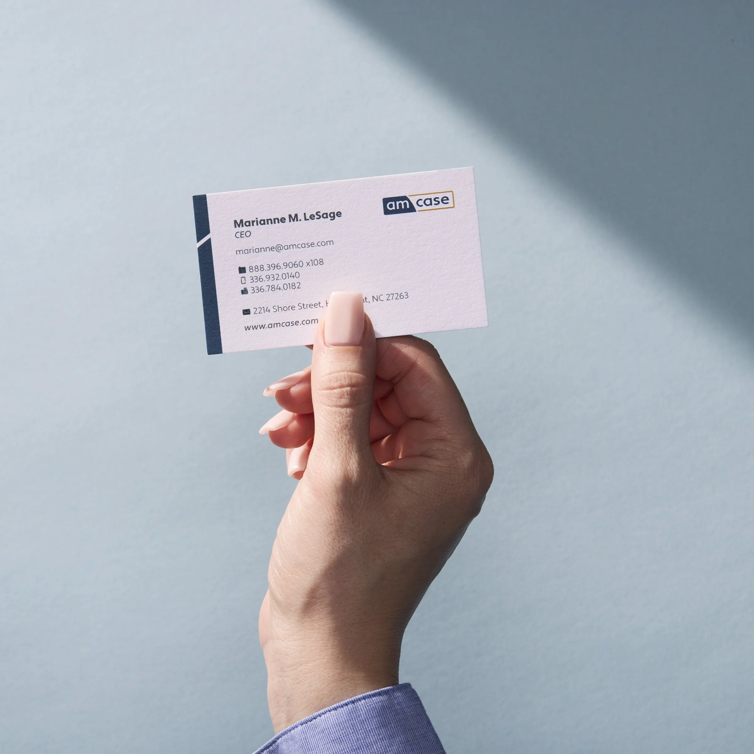
Amcase Stationery


The Pear-ing recently designed a fresh set of business cards and letterhead for our client, amcase. It was important to create a cohesive visual identity that reflects amcase's position in the modular cabinetry industry.
Both business cards and letterhead feature minimalist design, incorporating amcase's logo prominently against a clean background. This enhanced design conveys the brand’s design-forward sales approach.
Every interaction with customers should reflect the brand's message. Even fundamental items like stationery need to adhere to established brand guidelines for overall effective brand strategy.


